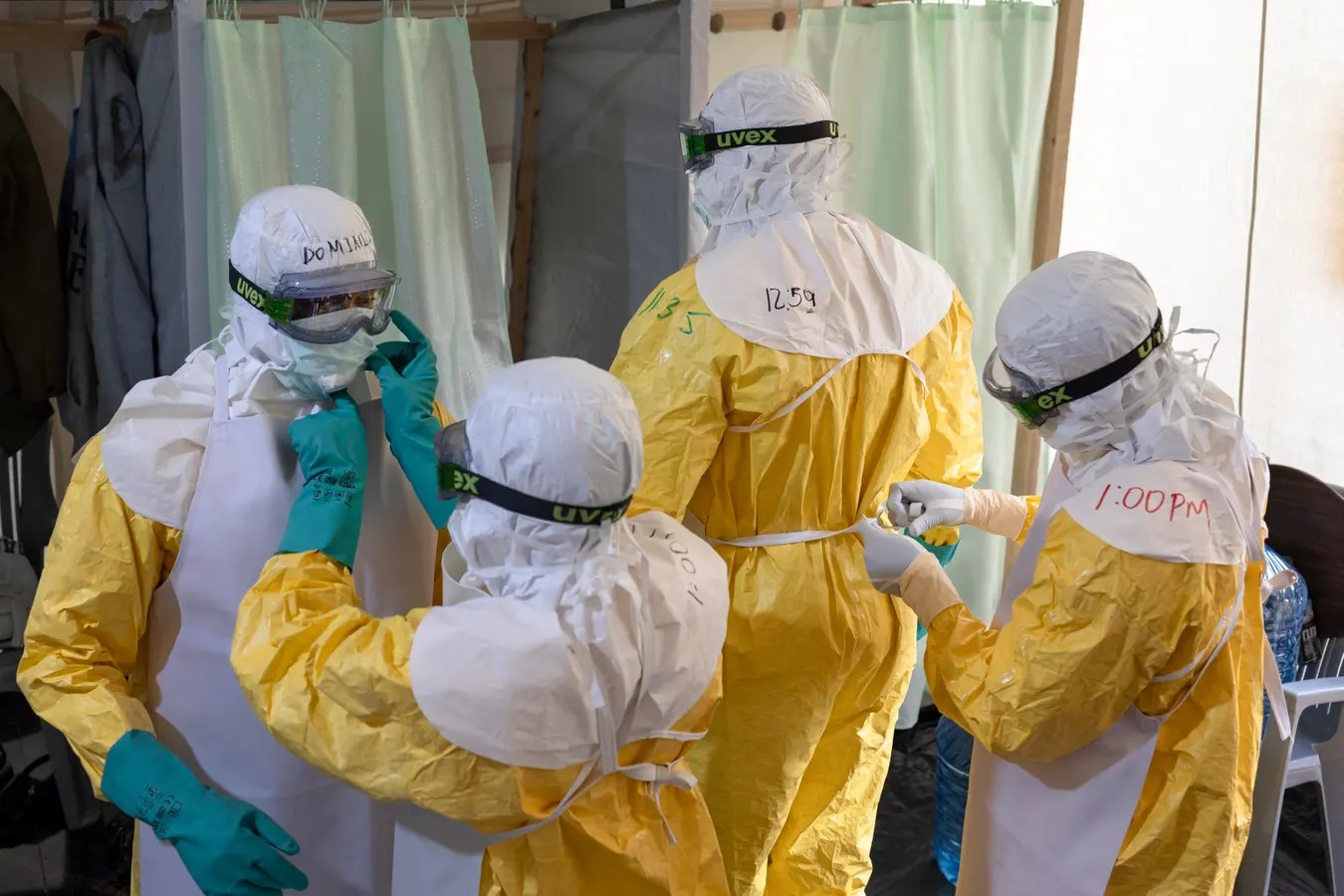
On January 25, a fifty-year-old woman died in Mongbwalu, a remote gold-mining town in the Ituri province of eastern Congo. She vomited blood. Her mother followed six days later. The husband got sick and got better.
No one called it Ebola. Not then. Not for another four months.
By May 15, when the Democratic Republic of the Congo finally declared an outbreak, the scale was already undeniable. As of today, the country has recorded 3,802 cases of the Bundibugyo ebolavirus. 1,707 people have died. Add 20 more cases just across the border in Uganda, and you hit 3,822. This is now the second-largest Ebola epidemic in history.
But here is the problem with the headline number. Those 3,822 infections are the ones that made it to a clinic. The ones that reached a laboratory.
Far more never did.
The Invisible Outbreak
The World Health Organization (WHO) told me this directly: the outbreak is “likely 3-4 times larger” than the official count. That estimate hasn’t been published as a formal report. If you multiply it out, the true number of infections sits somewhere between 11,50 and 15,320.
Chikwe Ihekweazu, head of WHO’s emergencies program, gave a clue in mid-July. He said 80% of new cases aren’t on any contact list. They come from unknown chains of transmission.
That statistic sounds definitive. It’s actually slippery.
It confuses two very different problems. First, cases that appear on your doorstep before the surveillance system knew about them. Second, cases where investigators gave up because there was no source to trace. Only the second one tells you how many infections are truly lost to the void.
A patient might be a complete mystery on Monday. By Friday, an epidemiologist might have mapped their entire family tree.
An email to me cleared this up. Once investigators finish their work, only 40-45% of cases have a known link to another infected person. The 20-25% who come directly from pre-existing contact lists are a tiny subset of that. There’s a fifteen to twenty-five percentage point gap of patients nobody was watching, whose source could eventually be figured out.
Then there’s the remaining 55-60%. These people have no identifiable source.
In July, 309 of the 671 cases documented well enough for analysis had a known link. That’s 46%. A ratio that has held steady since June. This implies that for every one case we count, there’s about one other person we’re missing. Maybe two.
Counting the Unseen
We can’t trace a patient back to their infector if that infector was never caught by the system. So the percentage of cases with a known link acts as a proxy for how well we’re detecting people in the first place.
Divide the confirmed cases by that detection rate, and you get an estimate of reality.
At a 46% detection rate, 3,822 confirmed infections suggests a total of about 8,300 cases. But treat that as a lower bound. A very soft, squishy one. That 46% figure only included the cases documented thoroughly. The sparse ones were left out, and they’re precisely the ones least likely to have a traceable history.
The other end of the spectrum is tighter. Only 20% of patients are on a contact list before they get sick. Anyone on a list beforehand is almost certainly counted. So that 20% figure understates the detection rate. If you use that to project outward—a fivefold correction—you get about 19,000 total infections.
So where does the truth lie?
Somewhere between 8,300 and 19,000.
The lower bound is an assumption. The upper bound is a structural limit. The WHO’s private estimate of a three-to-fourfold increase lands right in the middle, perhaps slightly above.
Publicly, WHO Director-General Tedros Adhanom Ghebreyesse has been more cautious. He warned that the real toll could be “more than double” the official number. His team’s internal numbers suggest something twice that again. Other models, like a June review from the European Centre for Disease Prevention and Prevention (ECDC), go even wider: a multiplier between 3.0 and 10.2.
That interval is useless for planning. It’s too broad to act on. It also allows for the possibility that our current count is actually correct.
A nowcast from the London School of Hygiene & Tropical Medicine (LSHTM) offers a different slice of the pie. They place total infections between 5,70 and 11,220 with 90% probability. WHO said that was consistent with their own view at the end of July. They’ve drifted apart since, likely due to model assumptions about what happened in January.
Why the Death Rate Looks So High
Scaling up confirmed cases to estimate true infections works for counting people. It doesn’t work cleanly for counting deaths.
A dead body is harder to hide than a mild fever. The infections our surveillance system misses are usually the milder ones—the people who never made it to a treatment center and stayed at home.
The real death toll is higher than 1,707. But it’s probably not three or four times higher.
Deaths lag behind infections by weeks. The LSHTM model estimates an additional 246 to 608 deaths among people infected before August 1. Even if transmission stopped today—which it won’t—those deaths would still occur.
Look at the case fatality rate from the other side. In June, 28.8% of confirmed patients died. A month later, that number jumped to 44.1%. WHO blames this spike on “persistent delays in case detection, referral, access to treatment,” and the “continued predominance of community deaths.”
This is a surveillance artifact. The system only finds the sicker patients. Or the ones who die at home and are only discovered during autopsy or burial rites. If the people who survive and recover never show up in the data, the death rate of the remaining cohort looks catastrophic. It’s not the disease acting faster. It’s the camera lens being dirty.
The Trajectory Matters More Than the Number
Every estimate here is an inference. A ghost built from the shadows cast by the surveillance system. A real serological survey—testing blood samples from communities across 49 health zones—would replace these guesses with hard data.
That won’t happen. Not with an active emergency. Not with armed groups attacking health facilities and hampering response operations. Not where insecurity is a daily threat.
We are forced to make decisions based on trajectories.
The reproduction number (R), or the average number of people each sick person infects, is currently around 1.1. Uncertainty ranges both above and below.
That’s an improvement from the original R of 2 to 3. But 1.1 still means growth.
Don’t get comfortable. An epidemic at 0.95 shrinks incredibly slowly. It could limp on for a year. Ending this outbreak in months—rather than years—requires pushing that number down to 0.5. That means cutting transmission by half from current levels. Across the 33 health zones in Ituri and beyond where it is still active.
The risk inside Congo remains “very high.” This is no longer just a rural crisis. The largest cluster is in Bunia, the provincial capital, with 880 cases. The virus is moving through areas controlled by armed groups and packed with displaced populations.
151 health workers are already infected.
We have seen this movie before. The West African outbreak of 2014 started in rural villages. It only exploded when it reached the capitals. It ended with 28,620 cases and 11,967 deaths. Nothing in today’s trajectory rules that outcome out.
The official numbers are a shadow. A phantom of the real crisis. We can’t go out and count what isn’t there. So we have to build a response for the ghost, knowing the monster behind it is much, much bigger.